Lesson 6: Making Adjustments and 3D EffectsAs you are working, you may find the colors in the different patterns you have chosen do not match as well as you thought they did. You can always adjust them. I will adjust the colors in the leopard pattern on the comforter and pillow shams to better match those in the rug and walls. So, I select the comforter layer and use Colors -> Color Balance.
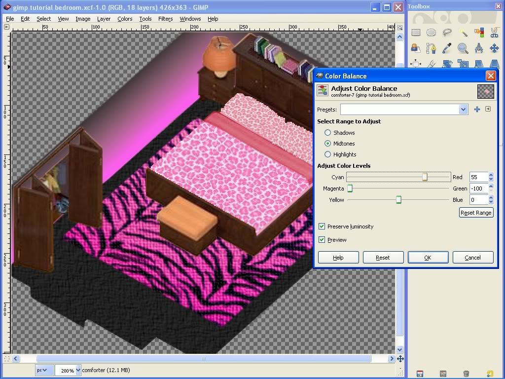
You can adjust the amount of each color in the shadows, highlights and midtones of the pattern separately until you have exactly the look you want. Always leave the preview box ticked so that you can see the result before pressing OK. Or, you may want to change your pattern completely.
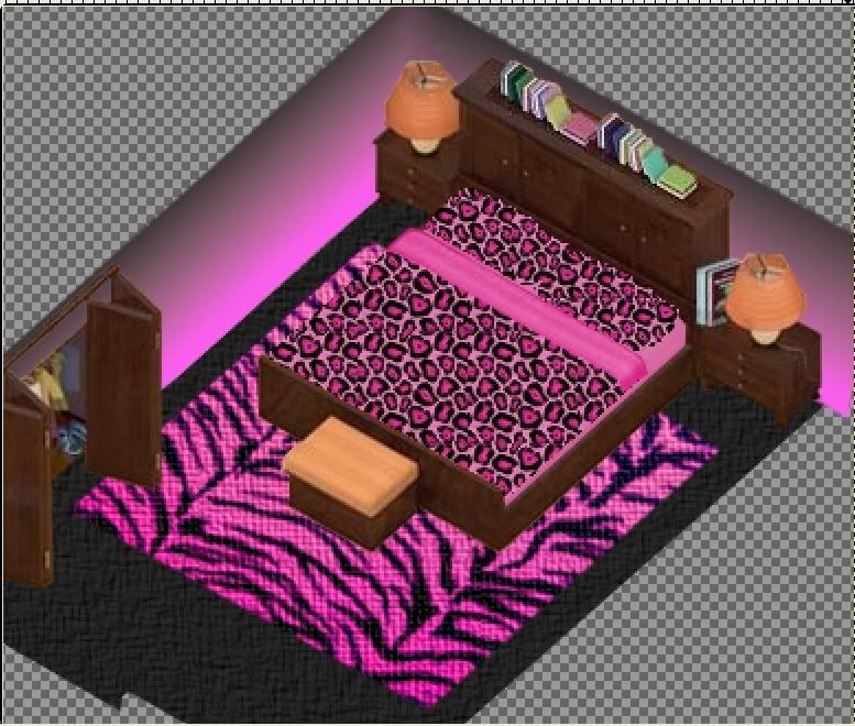
That is the fun of creating!
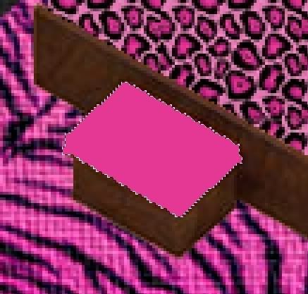
The bed bench cushion is looking really out of place now. We should color it. If you use colorize, you will be fine because it will retain the shading that gives it its shape. If, however, you use the bucket fill tool to fill it with a pattern or color, you will see that you now have a flat shape that no longer resembles a cushion.
It's time to learn about 3 dimensional effects.
The trick to making something appear 3D is light and shadow. When you shade something (add black to it, or make it darker) you make it appear farther away or smaller to the eye. Conversely, when you highlight something (lighten, or add white to it) you make it appear closer or larger. I will demonstrate this on the bed bench cushion.
You can refer back to your original background image to help you understand this a little better. If you think about the way light falls onto the bench cushion, it would hit the top, flat section of the cushion and be shaded beneath that on the sides of the cushion that angle down toward the floor. So, we will leave the flat section of the cushion alone for now and shade the side and front to make them appear 3D. Select the area you want to shade so that you don't accidentally shade anything else. Use the bucket fill tool to add black (click the foreground color square to change the color to black if necessary) and adjust the opacity (the opposite of transparency) to around 14-15% and use it to shade the selection.
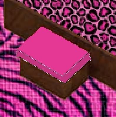
Because more light would hit the top edges of the bench, we will use the pencil tool to add white to that area as a highlight. Click the dual arrow icon to swap the foreground and background colors so that your active color is now white. Choose the pencil tool from the toolbox and set the opacity to around 10-11%. Choose a 3 pixel size fuzzy brush, to help us make the edges not so sharp. Use the pencil tool to highlight the top edges of the cushion. Use the Sumdge tool to blend these until you are happy with the look. Remember to save your work.
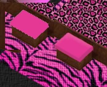
You can see the difference between the flat appearance without shadows and highlights and the 3D appearance of the one with them in the image below:
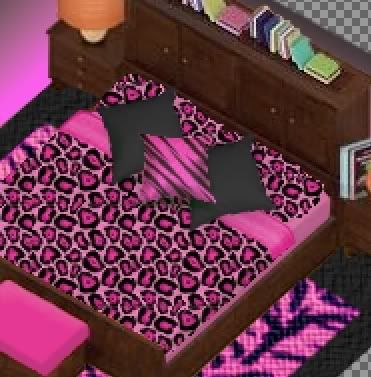
Use the same shading and highlighting techniques on the comforter and bottom sheet to given them the appearance of coming down on the sides of the bed and making the mattress look "full." I will use the same techniques to draw a few throw pillows on the bed. Start by drawing a basic square with the pencil tool, then use the eraser tool to trim in the sides where the edges would be "pulled" toward the middle. Shade the bottom and side of the pillow, while highlighting the areas you want to appear more full.


 Previous Topic
 Index
Index